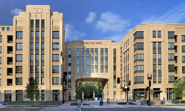
 Park Van Ness may be redefining a Washington, DC neighborhood, says Sarah Alexander.
WASHINGTON, DC—In a sense, this finalist in the 2016 edition of the NAHB Pillars of the Industry Awards competition is proof of the old adage that everything old is new again. The project replaces a rundown office asset in a lackluster area of the nation's capital. When it opened, it seemed to breathe new life into both the real estate and the neighborhood.
The Project: Park Van Ness
City: Washington, DC
Award Category: Best Mixed-Use Community
Developer: Saul Centers Inc.
Architect: Torti Gallas Urban
Interior Designer: RD Jones & Associates
Mission: The architect and the owner spent a year studying the 1920s building on Connecticut Avenue in the nation's capital, with the intent of an adaptive re-use. It's understandable. Despite the almost vacant, seen-better-days condition of the building, its classic bones were still evident. Even through a number of adaptations and what Sarah Alexander, associate principal at architecture firm Torti Gallas calls “several insults to its original art deco charm.”
“But unfortunately, as is often the case,” she continues, there were more challenges than opportunities in the current asset, including the fact that, “There weren't enough windows to be of any good use. So, after a year or so of studying it, it was determined to demolish the existing building and replace it.” Looking to the needs of the local Van Ness neighborhood, the team determined the next best use was as a multifamily asset.
It was an interesting site to work on, she says, for a number of reasons, beyond the original's building's checkered past, which included stints as a bowling alley and skating rink and a radio station. The plot straddled the intersection of Connecticut and Yuma avenues, the former being a major commuter thoroughfare. And there was a 50-foot drop immediately behind the acreage that overlooked a branch of Washington's famous Rock Creek Park.
Execution: The team – which included Alexander and colleague John Torti as co-designers – opted to go first class all the way in the creation of the new residence. Three primary features mark the unique nature of what would become Park Van Ness – and some of the challenges the designers faced. First was that drop-off to the park.
“There's a 50-foot change in grade from the street level to the park grade,” Alexander explains. “You actually enter the building on floor six. So there are five levels below the street for a total of 11 stories. That has its own several interesting challenges.”
For one, loading has to occur not at ground level but at the fifth floor, where there is a small dip from the street level. “We had to put in elevators we typically wouldn't need,” she says. Plus, even though it's only six stories high at street level, in reality it's an 11-story high-rise, “so we were required to meet high-rise building codes, like fireproofing and stair pressurization.”
The second distinguishing element was the creation of an art deco theme inside and out, something that recalled the original charm of the prior building. Alexander says the local community still relates to the homage to what had been.
“The decorative cast stone panels are all custom and designed in house,” she says. “We made 3-D prints of them prior to finalizing the design, and Modern Mosaic did an excellent job casting the final panels.” The designs were inspired by the previous art deco building style and features of the park.
Finally, “In terms of design, the largest thing we did was to create an archway in the building,” she says. The archway serves not only as a focal point and entryway, it helps to break up the massive 370-foot run of the front façade. In addition to adding visual interest, the archway, which aligns with the intersection of Yuma Avenue, served as a convenient staging area for building materials.
Alexander notes that the project was a matter-of-right project “and we were able to not only achieve the maximum allowable FAR, but we also captured about 20,000 square feet of bonus density by working with the grading and utilizing the District's cellar calculation method.”
End Game: In May of this year, the 271-unit Park Van Ness opened its doors. The art deco style appeals to the target Baby Boomer demographic, which is also drawn to the upscale 10,000 square feet of street-level retail, including an Italian restaurant on the south side and a market on the north. In the middle is the archway and courtyard, which provides views to the park for passersby and residents alike, who previously couldn't see it from the street.
Probably the biggest draw, however, is the view from the units, which are mostly market rate (there is an 8% affordability component, says the architect). Since the park grade gradually rises to the opposing street, there's a sweeping view of treetops for all residents. “That was a big sell,” says Alexander. Indeed. The building is 70% occupied as of this writing.
But probably one of the major benefits generated by Park Van Ness goes to the neighborhood itself. The project “commands top rents for Washington, DC,” says Alexander, in a neighborhood that was previously not among the most desirable.
“This started something,” she says. And there's talk of another similar project going up across the street.
Now that's progress.
© 2025 ALM Global, LLC, All Rights Reserved. Request academic re-use from www.copyright.com. All other uses, submit a request to [email protected]. For more information visit Asset & Logo Licensing.


